As part of our 4th Year Portfolio Module, we were tasked with remaking a previous folio piece, updating them to standard better fit for our current skill set. The original posters were based off of:
- Helvetica
- Bodoni
- Constructivism
- Grunge
- Bodoni
- Constructivism
- Grunge
In the updated variants, an additional poster was created, allowing for 5 total posters all ranging in styles;
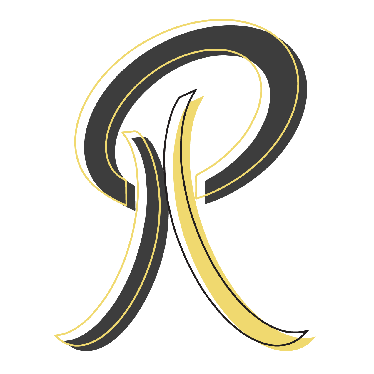
- Abstract
- Bodoni
- Helvetica
- Grunge
- De Stijl
- Bodoni
- Helvetica
- Grunge
- De Stijl
Video versions were created utilising After Effects. Each poster having a meaning of sorts behind them that have been visualised.
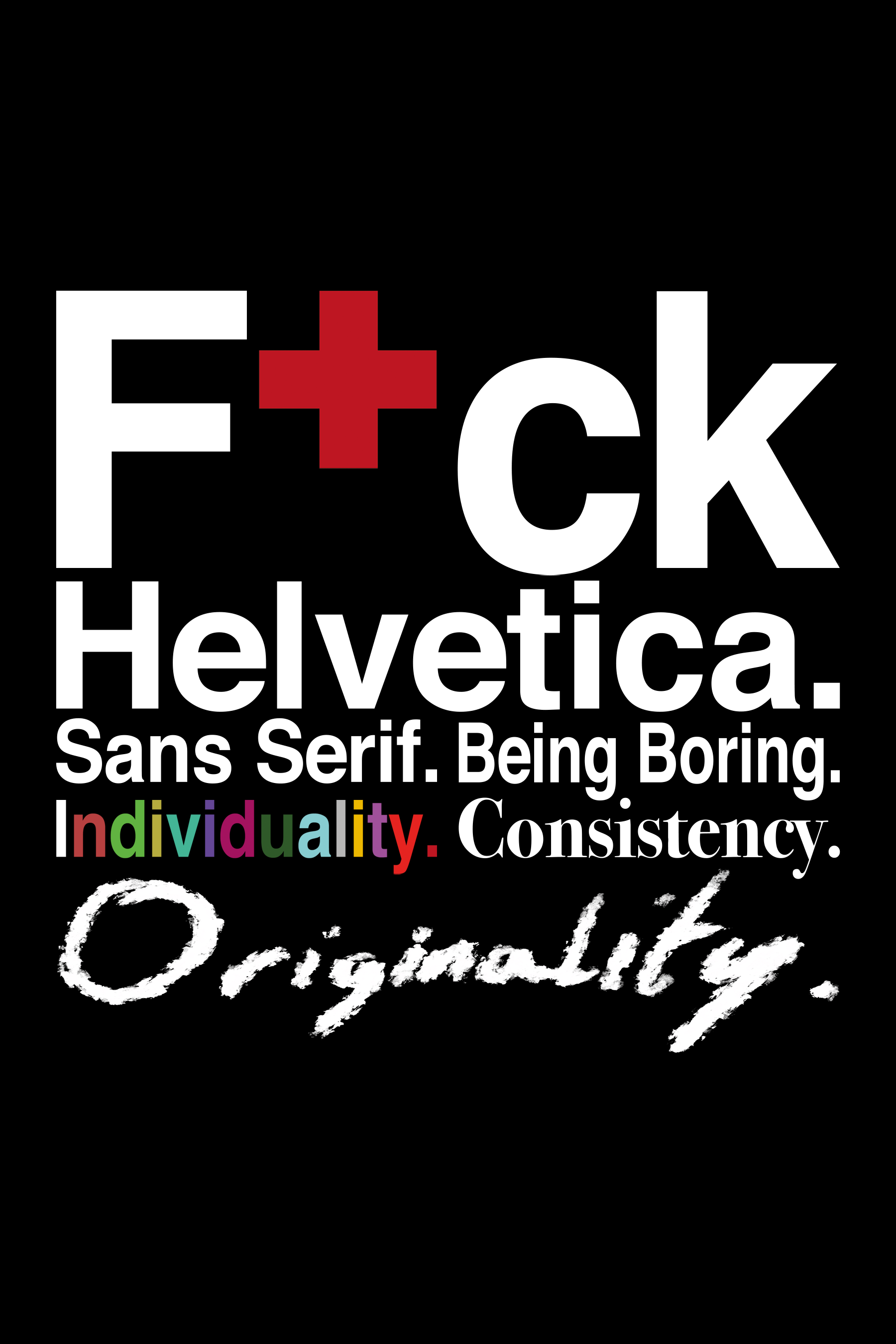
The Helvetica Poster is the only one that stayed mostly similar to its original, wherein the "F+ck" of "F+ck Helvetica" carried over. The statement the poster tries to convey is that of a designer. Why should they be all the same? Why shouldn't they be different? Why shouldn't they be creative? Basically, focusing on the core limits imposed on designers.
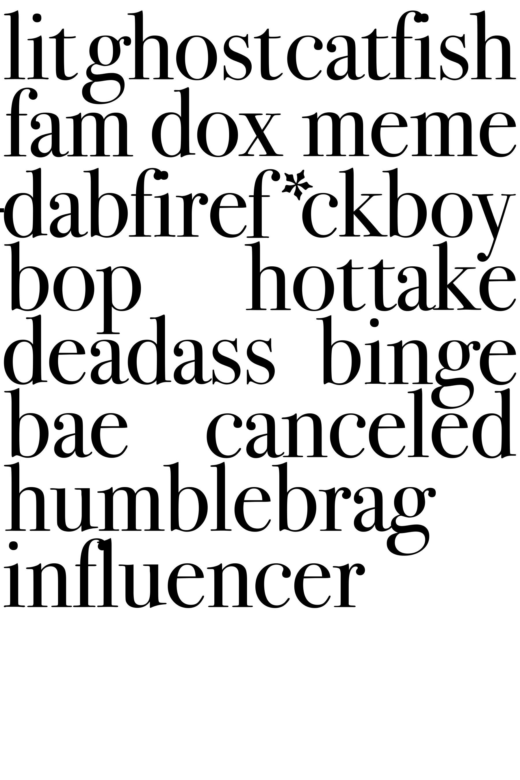
Bodoni - a very classic looking font from the 18th Century. What better way to corrupt it than using it to convey all the most popular words of the 2010-2019 era? The words were all acquired from Buzzfeed.
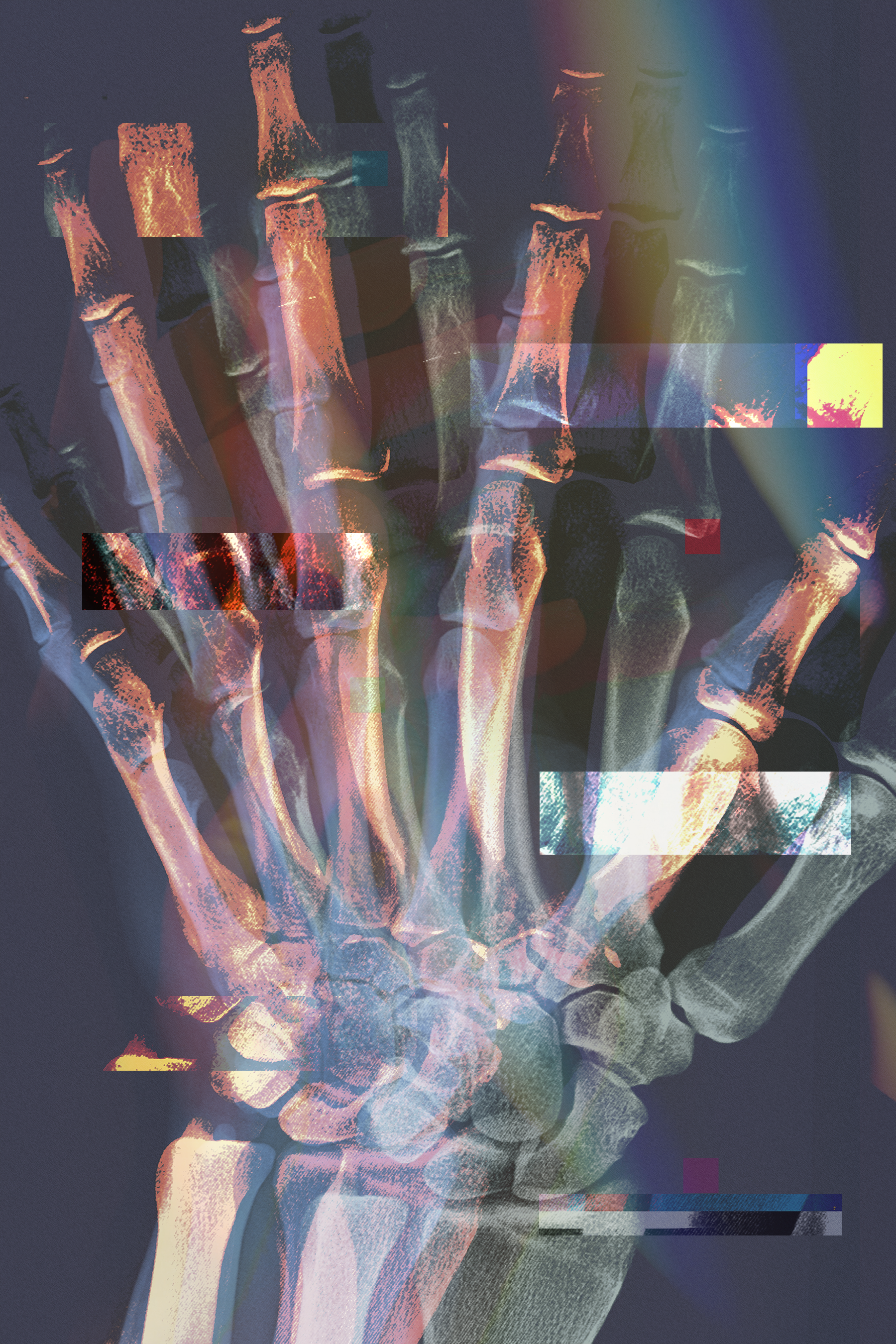
For Abstract, the main focus was on the hand - a limb I heavily looked at when trying to find a creative inspiration to fit the abstract concept. Creativity is in the palm of your hands.
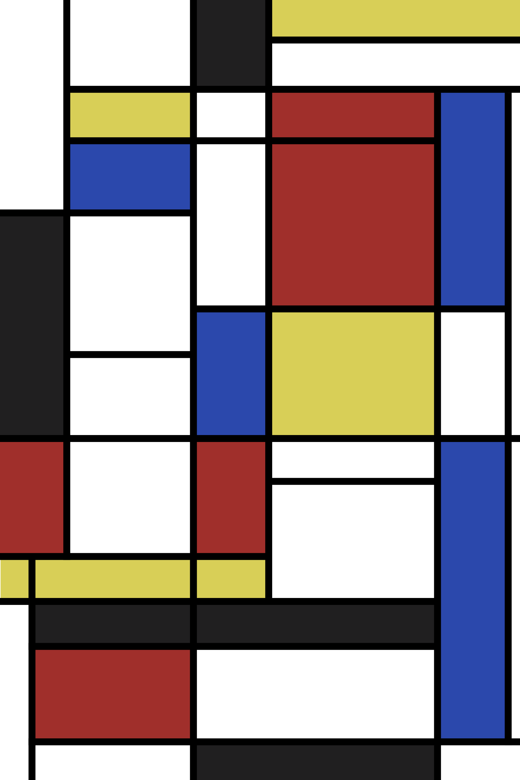
De Stijl. Not really a visually political style on first glance, is it? Well, not when compared to the likes of Constructivism. Over 2019 (and early 2020), Donald Trump, Boris Johnson and Greta Thunberg were 3 of the most talked about/Controversial people of the last year, all for different reasons.

For Grunge, the aim was to tie back to the De Stijl poster (specifically, Greta), with the focus on the planet Earth being doomed. A hand is featured reaching out for the planet as it is covered up by smoke and faded in colour.