As part of my brief to modernise/rebrand the "alba beverage" logo, the core beliefs for the brand needed to still be present via the logo.
The main goal was to improve the brand for a wider social media reach alongside the launch of their updated website, as well as a more visual style.
Variations of the logo were first made. This primarily focused on typeface options and a stacked left-aligned look for the logo.
Early on it was made clear that the logo needed to remain in lowercase, and similar to the original typeface.
Elements, such as the stacked visual and the gradient developed from the original 2 colours used were carried through to the final designs.

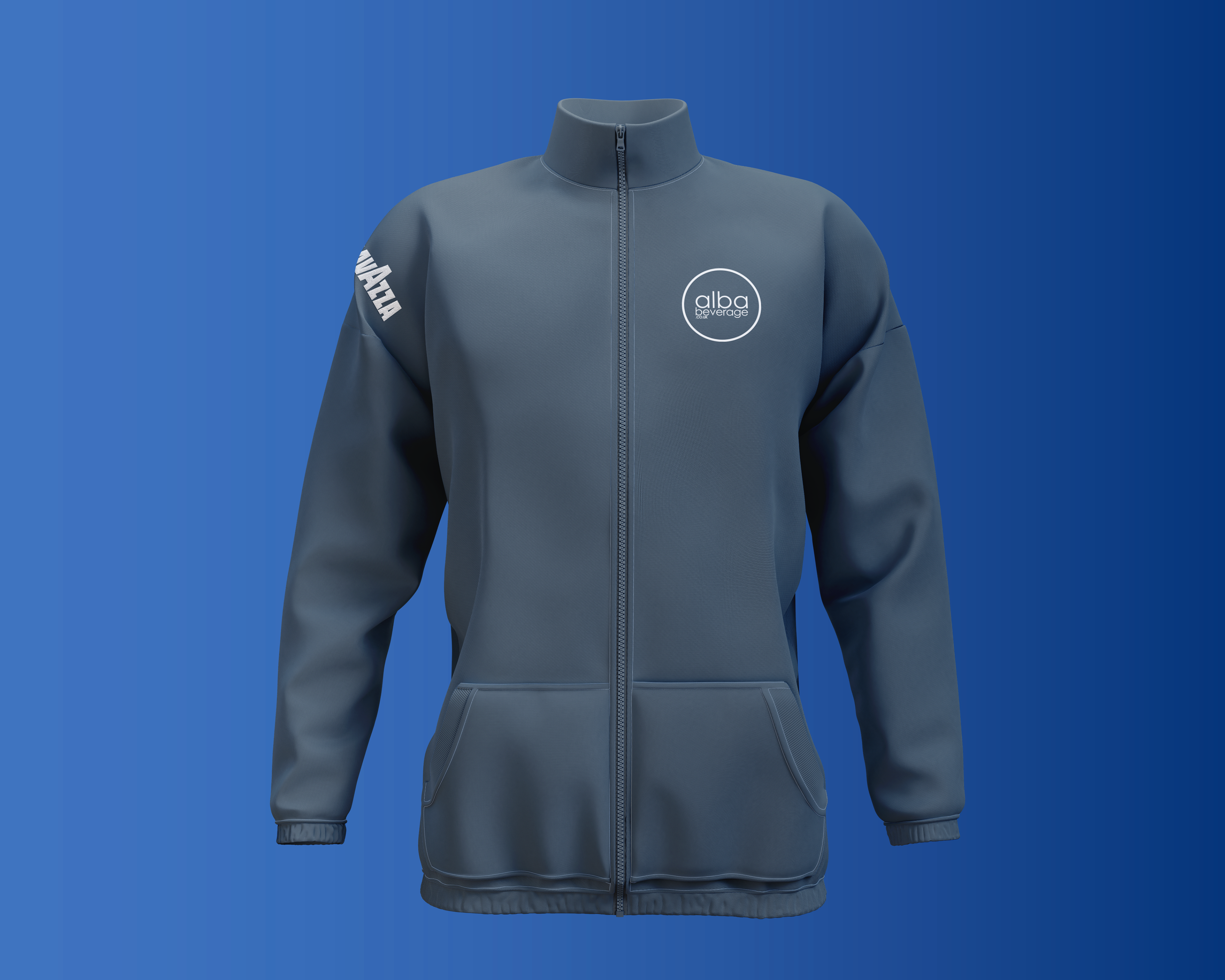
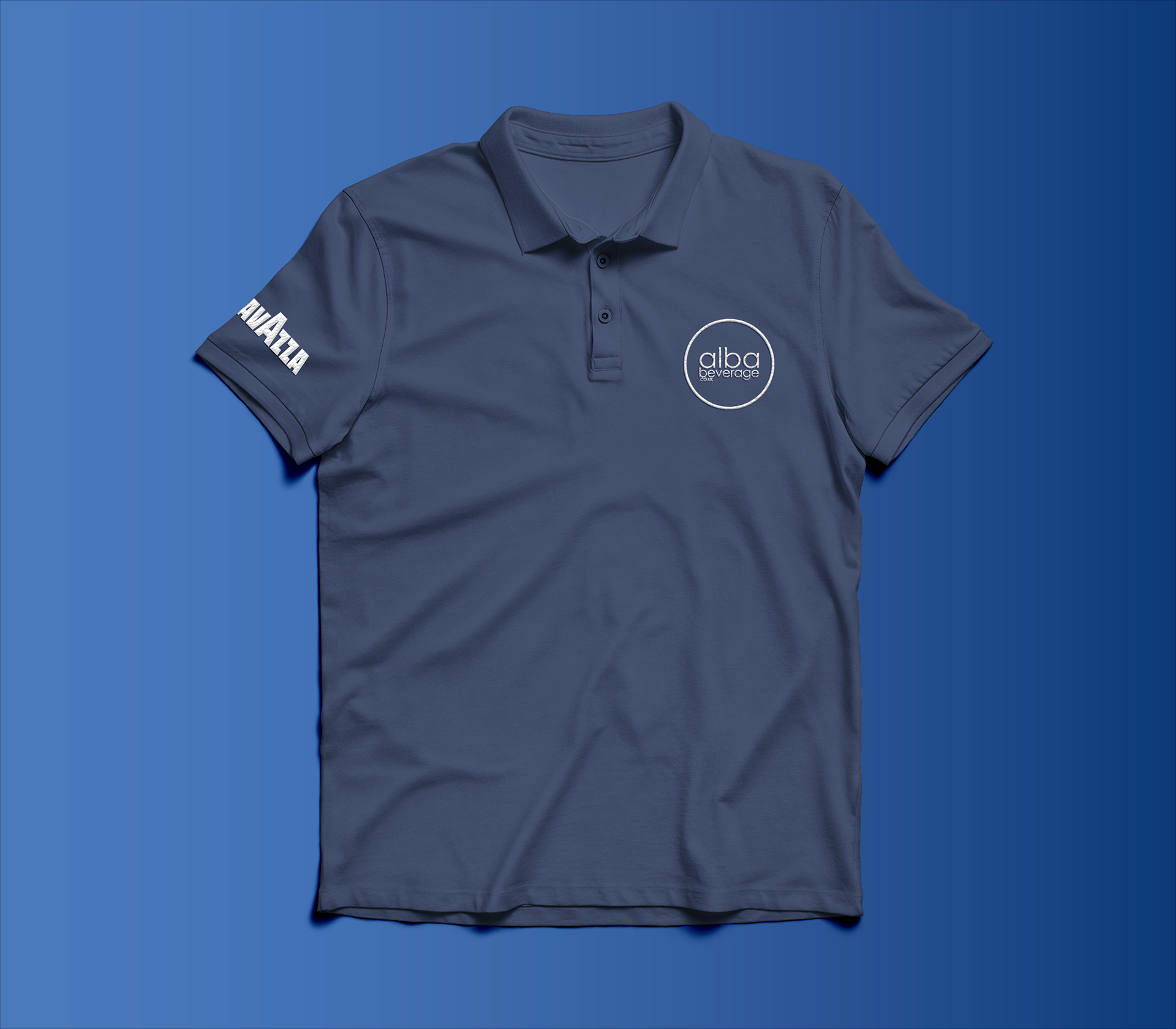
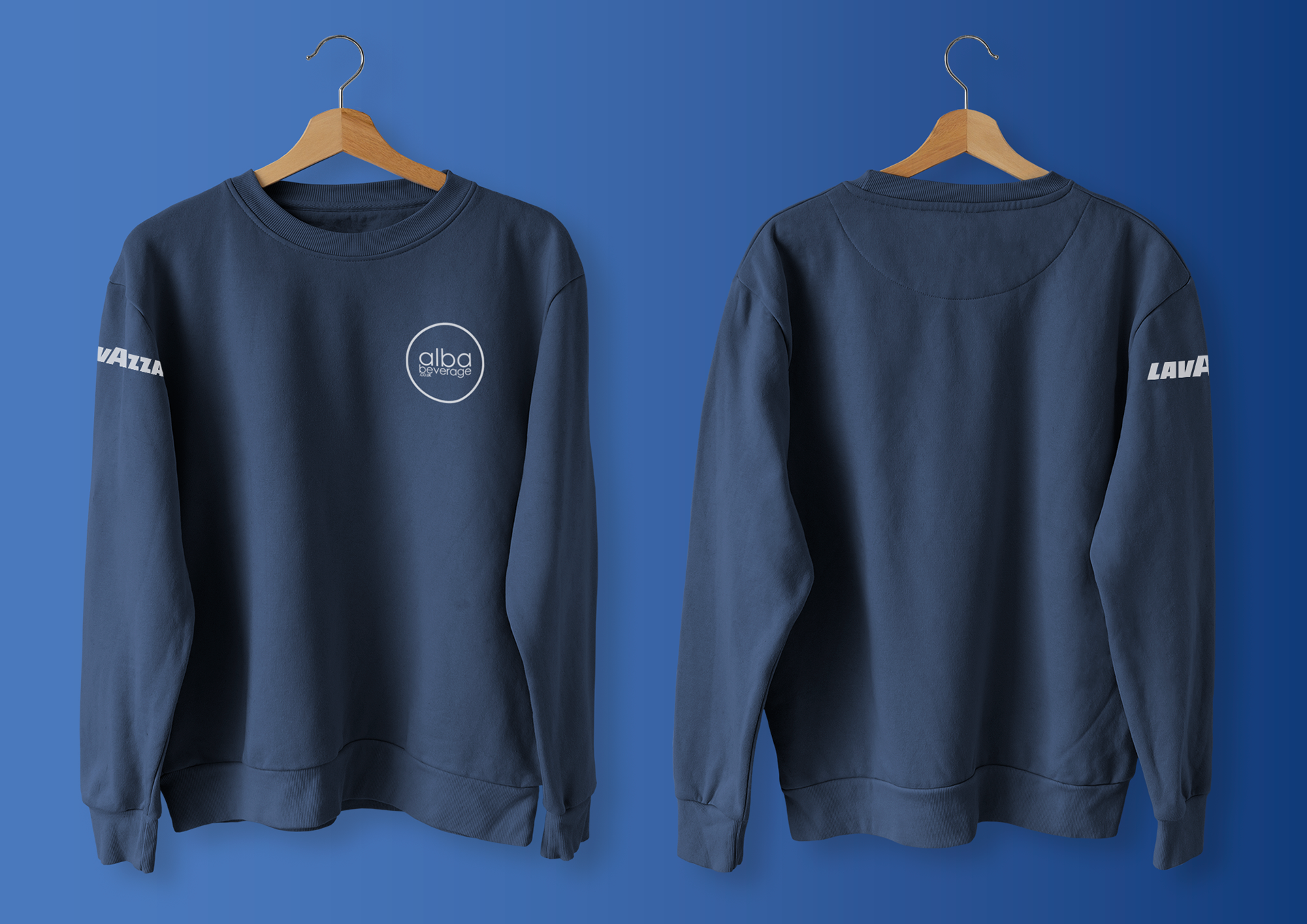
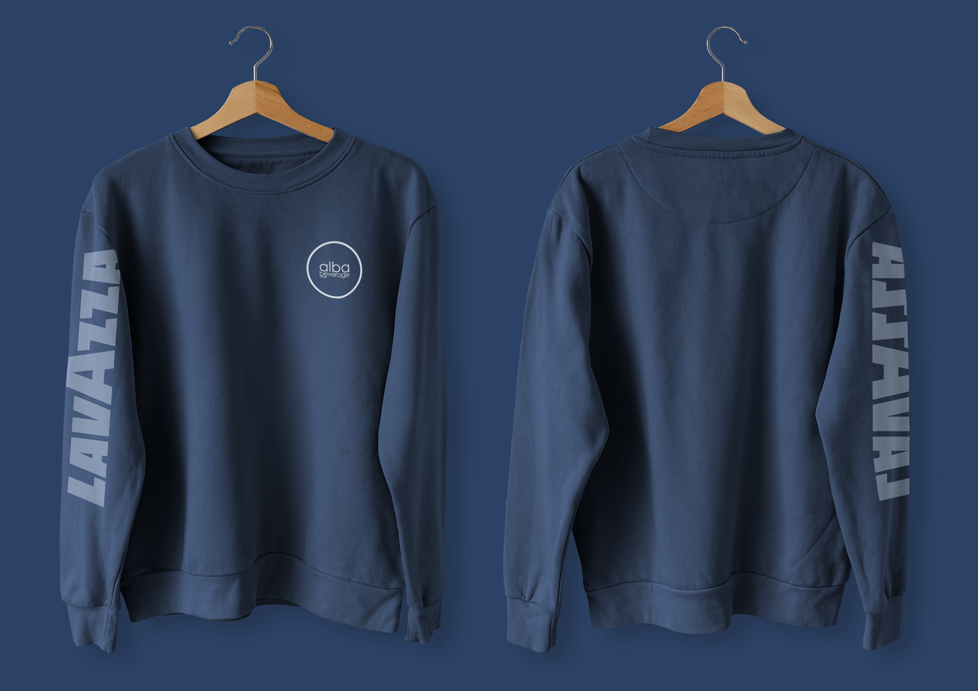
The new branding was also mocked up on what would be the uniform worn by staff members when working on site.
